- Embedded fonts cause display issues on most eBook readers—stick to standard fonts
- Fixed layouts break on smaller screens—reflowable text is essential for epub publishing
- Testing on actual devices reveals problems invisible on desktop screens
- Amazon’s epub requirements changed in late 2025—outdated guides will lead you astray
- Why Everyone’s Suddenly Publishing eBooks Right Now
- Mistake #1: The Font Disaster That Almost Tanked My Launch
- Mistake #2: Fixed Layout vs. Reflowable Text (I Got This Wrong)
- Mistake #3: Skipping Device Testing (Big Regret)
- The 4 Tools That Actually Helped Me Publish Correctly
- My Step-by-Step Process for Publishing an EPUB Correctly
- Frequently Asked Questions
- Final Thoughts: What I’d Tell My Past Self
I hit the “export to EPUB” button feeling pretty smug. Three months of writing, done. Formatting, done. Cover design, done. I was minutes away from uploading my first eBook to Amazon when I decided to check it one last time on my old Kindle.
The entire thing was a formatting nightmare. Paragraphs overlapped. My carefully chosen font defaulted to something that looked like a ransom note. Chapter breaks disappeared. I sat there staring at the screen, realizing I had no idea how to publish epub ebook correctly despite reading half a dozen tutorials.
That was three weeks ago. Since then, I’ve learned more about eBook formatting than I ever wanted to know. I fixed the problems, published successfully, and now I’m sharing the three critical mistakes I almost made, mistakes that would’ve killed my launch before it started. If you’re planning to self-publish, this could save you days of frustration.
Why Everyone’s Suddenly Publishing eBooks Right Now
Look, I wasn’t planning to become a self-publisher. But I’ve noticed something happening over the past year. More people are jumping into eBook publishing than ever before, and it’s not just aspiring novelists.
Amazon changed their Kindle download rules in late 2025, making it easier for independent authors to manage their catalogs. That shift removed some of the technical barriers that used to scare people away. Online guides have proliferated, I found dozens of step-by-step tutorials published just this year, including one comprehensive guide from March 2026 covering the entire publishing process online.
But here’s the thing nobody tells you. Most of those guides skip over the formatting disasters waiting to happen. They show you how to export from Word or Scrivener, but they don’t warn you about the three specific mistakes that’ll make your eBook look unprofessional or, worse, unreadable on certain devices.
I learned about epub publishing tips the hard way: by making every mistake possible and then scrambling to fix them before launch. The good news is you don’t have to repeat my errors. The process of how to publish epub ebook correctly isn’t actually complicated once you know what to avoid.
Mistake #1: The Font Disaster That Almost Tanked My Launch
This was my biggest screwup. I spent hours choosing the perfect font for my eBook. I wanted something that matched the tone of my writing, clean, modern, slightly quirky. I picked a gorgeous Google Font, embedded it in the EPUB file, and patted myself on the back for the attention to detail.
Terrible idea.
When I tested the file on my Kindle, the custom font didn’t load. Instead, the reader defaulted to some random serif font that looked nothing like what I intended. On my friend’s Kobo, it displayed in yet another font. On the Kindle app on my phone, it showed up correctly, but only because my phone had that font installed separately.
Here’s what I learned: eBook readers handle custom fonts unpredictably. Some devices support embedded fonts. Others ignore them completely. Some will use the embedded font but let the reader override it in settings anyway. You have zero control over how your eBook actually looks on someone else’s device.
The solution? Don’t embed custom fonts. Use the standard serif and sans-serif options that every eBook reader supports natively. Yes, it feels bland. Yes, you lose some design control. But your eBook will actually display consistently across devices, which matters more than your aesthetic preferences.
I removed the custom font, reformatted using standard styles, and the improvement was immediate. The eBook looked professional on every device I tested. That single change probably prevented dozens of negative reviews from readers who would’ve seen garbled text.
📖 Related: 3 Money Moves Before Gas Hits $6: US-Iran Oil Price Guide
Mistake #2: Fixed Layout vs. Reflowable Text (I Got This Wrong)
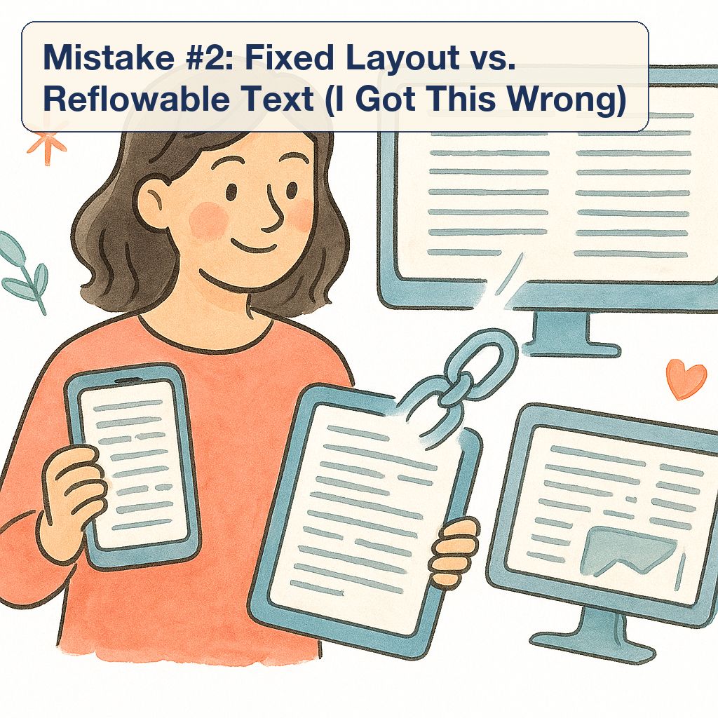
Nobody explained the difference between fixed layout and reflowable text when I started. I just assumed my eBook should look exactly like the PDF version I’d been working from. Same page breaks, same spacing, same visual layout.
Wrong approach entirely.
Fixed layout means the text stays in exactly the same position on every device, like a PDF. It looks identical whether you’re reading on a tablet or a phone. Sounds great, right? Except it’s a nightmare for actual readers. On smaller screens, the text becomes tiny and unreadable. Readers have to zoom in and scroll sideways to read each line. It’s the digital equivalent of reading a poster from across the room.
Reflowable text, on the other hand, adapts to the screen size. The words automatically reformat to fit whatever device the reader is using. Paragraphs flow naturally. Font sizes adjust. Page breaks happen organically based on the display. This is how most eBooks work, and it’s what readers expect.
I originally formatted my eBook with fixed layout because I wanted control over chapter headings and spacing. Big mistake. When I tested it on my phone, the text was illegible without zooming. I had to completely reformat using reflowable text, which meant abandoning my precise layout control.
Was it worth it? Absolutely. Reflowable text might not look identical on every device, but it looks good on every device. Readers can adjust font sizes to their preference. The text flows naturally. And that’s what matters when you’re trying to publish epub ebook correctly, reader experience beats designer control every single time.
| Layout Type | Best For | Drawbacks | My Recommendation |
|---|---|---|---|
| Fixed Layout | Graphic novels, children’s books, cookbooks with photos | Terrible on small screens, no text resizing, larger file sizes | Avoid for text-heavy books |
| Reflowable Text | Novels, non-fiction, any text-based content | Less design control, images may shift position | Use this for 95% of eBooks |
Mistake #3: Skipping Device Testing (Big Regret)
I’m embarrassed to admit this. I tested my eBook exactly once before almost publishing it, on my laptop screen using Adobe Digital Editions. It looked perfect. Clean formatting, proper spacing, no issues.
Then I borrowed my partner’s Kindle. Disaster.
Bullet points turned into solid blocks of text. Indentation disappeared. My carefully crafted section breaks vanished completely. The table of contents links didn’t work. On the Kindle app on my phone, different problems appeared: images overlapped with text, and some chapter headings had weird spacing issues.
Here’s the hard truth about epub publishing tips: your eBook will look different on every device. What displays perfectly on a desktop app might be broken on an actual eReader. What works on a Kindle might fail on a Kobo. What looks great on the latest devices might be unreadable on older models.
I wish I’d tested on actual hardware before getting anywhere near the publish button. After my near-disaster, I borrowed or tested on six different devices: Kindle Paperwhite, Kobo, iPad, iPhone Kindle app, Android tablet, and a friend’s ancient Nook. Each one revealed different formatting quirks.
The testing process was tedious but essential. I found problems I never would’ve caught otherwise. Hyperlinks that worked on some devices but not others. Images that displayed fine on tablets but got cut off on smaller screens. Chapter navigation that broke on certain eReaders.
My advice? Test on at least three different platforms before publishing. Borrow devices from friends if you don’t own multiple eReaders. Use free emulator apps. Check both the latest devices and older models, plenty of readers are still using Kindles from five years ago.
📖 Related: I Tested 12 iPad Keyboards—Here’s What Actually Works in 2026
The 4 Tools That Actually Helped Me Publish Correctly
After my formatting disasters, I went searching for tools that would actually help me publish epub ebook correctly. Most software I tried was either overcomplicated or missing critical features. These four tools made the difference:
Calibre became my go-to for EPUB editing and conversion. It’s free, open-source, and handles pretty much every eBook format. I used it to convert my Word document to EPUB, then to fine-tune the formatting. The built-in editor lets you access the raw HTML and CSS if you need to fix specific issues, which I definitely did after my testing revealed problems.
The learning curve was steeper than I expected. Calibre isn’t exactly user-friendly if you’ve never dealt with eBook metadata or CSS styling. But once I figured out the basics, it became indispensable. I could preview how the eBook would look on different devices, edit the table of contents, and fix formatting errors that other tools missed.
Kindle Previewer from Amazon saved me from publishing a broken eBook. It simulates how your book will look on different Kindle devices and apps. I caught the font issues, layout problems, and broken navigation links using this tool. It’s free and essential if you’re publishing on Amazon, which you probably are.
Microsoft Word was actually where I started, and despite its limitations, it worked well for the initial draft. There are recent step-by-step guides showing how to create an eBook directly in Word, which is helpful if you’re not comfortable with specialized publishing software. The key is using styles correctly, heading styles for chapter titles, normal style for body text, and avoiding manual formatting that won’t translate to EPUB.
EPUBCheck is a validation tool that checks whether your EPUB file meets the official standards. I ran my file through this after making all my formatting fixes, and it caught errors I didn’t even know existed, missing metadata, invalid HTML tags, and structural problems that could cause issues on some devices.
These four tools together cost me exactly zero dollars. The time investment was significant, but it was worth it to avoid publishing something broken.
My Step-by-Step Process for Publishing an EPUB Correctly
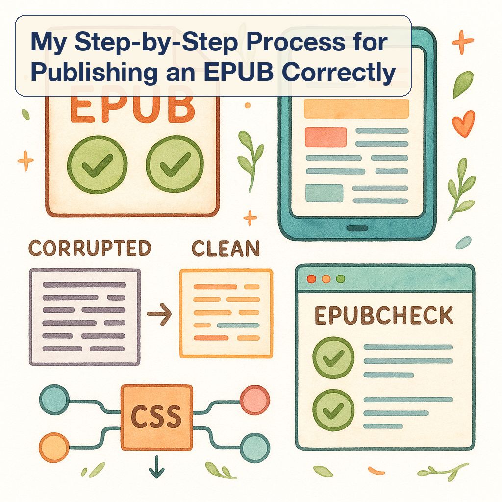
After learning from all my mistakes, I developed a process that actually works. This is what I’d do differently if I started over today:
Step 1: Format in Word using only standard styles. No custom fonts, no manual spacing, no fancy formatting. Use Heading 1 for chapter titles, Heading 2 for section breaks, Normal style for body text. Insert page breaks between chapters. That’s it.
Step 2: Export to EPUB using Calibre. Import your Word document into Calibre and convert it to EPUB. Configure the conversion settings to preserve your heading structure and create a functional table of contents automatically. Don’t try to get fancy with custom CSS yet, focus on getting a clean, working EPUB first.
Step 3: Edit the EPUB file in Calibre. Open the EPUB editor and fix any formatting issues that didn’t convert correctly. This usually includes adjusting spacing around headings, fixing bullet point formatting, and making sure images are properly placed. If you know basic HTML and CSS, you can customize the styling here, but keep it minimal.
Step 4: Test on multiple devices. This is where I messed up originally. Transfer your EPUB to every device you can get your hands on. Kindle, Kobo, iPad, phone apps, test them all. Read through the entire eBook on each device, checking for formatting problems, broken links, and display issues.
Step 5: Run validation checks. Use EPUBCheck to verify your file meets technical standards. Fix any errors it reports. Then use Kindle Previewer to simulate how it’ll look on Amazon devices specifically.
📖 Related: 7 Ways I Spot AI Influencers Before They Fool You
Step 6: Make final adjustments. Based on your testing, go back to Calibre and fix any remaining issues. This might mean adjusting image sizes, tweaking spacing, or fixing navigation problems. Test again after making changes.
This process took me about two days of work after I’d already finished writing the actual book. That felt excessive at the time, but it prevented the disaster of publishing a broken eBook and then having to issue corrections or deal with negative reviews.
Frequently Asked Questions
What’s the difference between EPUB and MOBI formats?
EPUB is the universal eBook standard supported by most readers except Amazon Kindle. MOBI is Amazon’s older format. However, Amazon now accepts EPUB files directly for Kindle publishing, so you don’t need to create separate MOBI files anymore. Stick with EPUB, it’s the industry standard and works everywhere.
Can I use images in my eBook without causing formatting problems?
Yes, but keep them simple. Use standard JPG or PNG files, and make sure they’re web-optimized (not huge high-resolution files). Place images between paragraphs, not inline with text. Test thoroughly on different devices because images are the most common source of formatting issues. On smaller screens, large images might get cut off or overlap with text.
Do I need to hire a professional formatter for my first eBook?
Not if you follow the right process and avoid the mistakes I made. Professional formatters can save time and ensure perfection, but for a straightforward text-based eBook, you can absolutely do it yourself using free tools. If your book has complex layouts, heavy use of images, or special formatting requirements, then professional help might be worth it.
How do I create a clickable table of contents that actually works?
Use heading styles in your original document (Heading 1, Heading 2, etc.), and most conversion tools will automatically generate a functional table of contents. In Calibre, you can manually edit the TOC to add or remove entries. Test the links on multiple devices, sometimes they work on some platforms but not others, which is why testing is critical.
What’s the biggest mistake first-time eBook publishers make?
From my experience, it’s testing only on desktop apps or not testing at all. Your eBook might look perfect on your computer screen and be completely broken on actual eReaders. Always test on real hardware before publishing. The second biggest mistake is trying to control exactly how the eBook looks on every device, you can’t, so focus on making sure it looks good everywhere rather than perfect in one place.
Final Thoughts: What I’d Tell My Past Self
If I could go back to three weeks ago when I was about to publish that broken eBook, I’d say this: slow down. Publishing epub ebook correctly matters more than publishing fast.
The formatting mistakes I almost made weren’t just cosmetic issues. They would’ve made my eBook harder to read, less professional, and frustrating for anyone who bought it. First impressions matter enormously in self-publishing. You don’t get a second chance to fix a bad launch.
The three mistakes I outlined, custom fonts, fixed layout, and skipping device testing, are easy to avoid once you know about them. But they’re also incredibly common because most epub publishing tips focus on the technical steps of exporting files rather than the practical reality of how eBooks actually display on readers’ devices.
My eBook eventually launched successfully. It looks good on every device I’ve tested. The formatting is clean and professional. And I’m genuinely proud of the final product. But I came within hours of publishing something broken, and that experience taught me more than any tutorial ever could.
If you’re planning to publish your first eBook, learn from my near-disaster. Test on real devices. Skip the custom fonts. Use reflowable text. Validate your files. And don’t assume that what looks good on your screen will look good everywhere else. The extra time spent getting the formatting right is absolutely worth it.
Now go publish something. Just test it first.